Website identification game proves the importance of design fundamentals
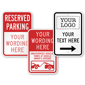
If you see a red octagonal sign with bold, white type at an intersection, it’s a pretty safe bet that you’re supposed to come to a complete stop. You don’t need to speak the language. Your eyes don’t need to be sharp enough to read “S-T-O-P.” You don’t need to have any other information.
That’s because your brain is wired to recognize the fundamental visual elements of the message — even if you don’t actually read it.
Our brains subconsciously process these fundamental visual elements all day long. And it’s not just about street signs. Take, for example, the web. Unless you’re a web developer or designer, you may not pay a whole lot of attention to the skeletons of your favorite web pages. That is — at least not on a conscious level. A game called “Dedesign the Web” proves that our brains actually do pay attention to web design.
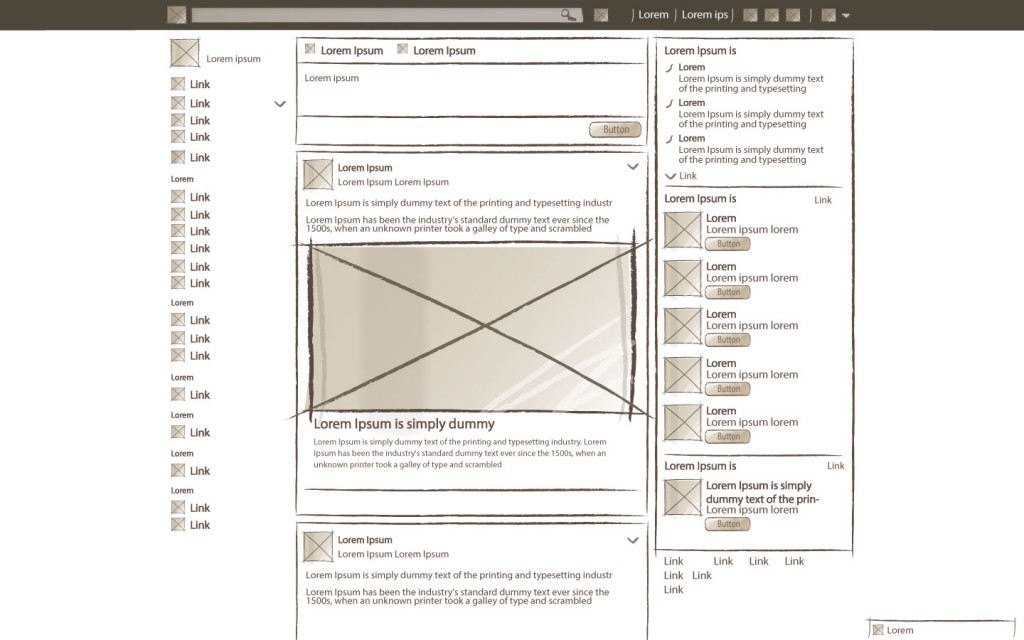
Here’s how Dedesign the Web works: The game strips away all of the layers and surface design elements of a website. There are no colors, images, logos, fonts, or words. All you see is the wireframe elements of the basic web skeleton. (In plain English, that’s essentially a layout: gray boxes as placeholders for photos; text boxes as placeholders for text, etc.)

Can you recognize this website? From Dedesign the Web 2.
You might be surprised to see just how easy it is to still recognize your favorite website without all the signature design elements. I was skeptical, but I recognized several of the sites right away. Facebook, Pinterest, YouTube, Wikipedia — as it turns out, all these pages have extremely distinctive layouts that distinguish them from the rest.
Fast Company’s John Brownlee laments that his success at the Dedesign the Web game is indicative of his having spent far too much time on each of these websites. I’m inclined to respectfully disagree with Brownlee. I think that success at the game is, instead, a testament to the incredible power of signature design.
We think of color and font and language as the key elements of branding, but what about the basics? What about shapes? What about layout?
How much space do you want for a photo? How many photos will you use? How big are your text blocks?
If you need more proof that these fundamental elements matter, consider one of the most successful brands in history: Apple. They practically have their own genre of design. Their signature design is about so much more than color and font. Their focus on cleanliness and massive amounts of white space have inspired a million copycats.
Font is important, of course — and so is color. But don’t overlook the basics. You don’t have to take our word for it: try Dedesign the Web and Dedesign the Web 2 for yourself.


