There’s a lot the average person probably doesn’t know about stencil typography. A few examples cited in this recent Co.Design article:
- It’s nothing new. In fact, it’s an ancient technique, dating back to the caveman days.
- Its use isn’t limited to any particular part of the world. It’s been found in prehistoric Chinese and Japanese art as well as the work of indigenous people all over the globe.
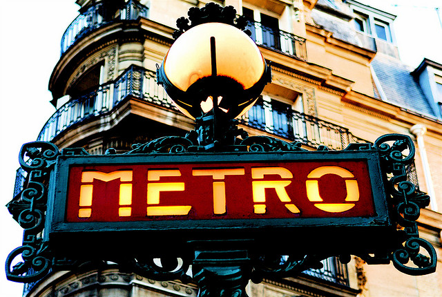
- Stenciled letters may look “chopped up,” but they’re actually formed using basic shapes. Rectangles, triangles, and parts of circles—with spaces in between—combine to become what we see as letters.
- Because of the above, stenciled letters are easier to read than non-stenciled. The style is especially useful on printed materials that need to be deciphered from a distance. The farther you stand from a stenciled sign, the easier it is to read.

Paris Metro signs use stenciled lettering. From Pedro Ribeiro Simões.
This is the sort of information compiled in Stencil Type (Thames & Hudson, 2015), a book by designers Steven Heller and Louise Fili. It follows several previous books by this pair, including Vintage Type and Graphics: An Eclectic Collection of Typography, Ornament, Letterheads, and Trademarks from 1896 to 1936, (Allworth Press, 2011) and Scripts: Elegant Lettering from Design’s Golden Age (Thames & Hudson, 2012), as well as many more by the designers individually, including Louise Fili’s Elegantissima: Design & Typography of Louise Fili (Princeton Architectural Press, 2012) and Steven Heller’s Graphic Style Lab (Rockport Publishers, 2015).
While perhaps appealing to designers in particular, Stencil Type has obvious allure to the average reader, too. There’s no denying the charm of the photos, particularly the retro-looking “Orange Crush” printed on an orange background (likely a crate) and the signs from the Paris Metro. What is it about those stenciled letters that makes you want to gaze at them? Is it the simple shapes? The easy readability?
If you do find yourself caught up perusing the photos in Stencil Type, rest assured it’s a natural reaction. Stenciled lettering really is visually appealing. As this article’s author points out, that’s the reason it’s used so often on signs, in the military, and in the transportation industry. It’s the reason revolutionary movements—such as Occupy—have used it to state and symbolize their messages.
Expect to experience the Baader-Meinhof phenomenon now. Just as when you hear a word for the first time and then you hear it everywhere, you’ll probably start noticing stenciled letters everywhere, too.