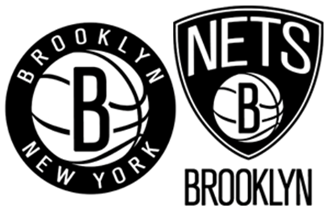
The redesigned logos for the Brooklyn Nets were revealed on Monday.
May 1, 2012 —
The Brooklyn Nets basketball team unveiled a brand new logo this week to accompany their relocation to Barclays Center for the 2012-2013 season. The logo, which was revealed in two complimentary formats, takes a minimalist approach with its black and white coloring and simple, stylized lettering. Partial team owner and rapper Jay-Z headed the design crew for the new emblem, christening it the new “shield of Brooklyn.”
Russian hip-hop mogul Mikhail Prokhorov, the majority owner of the Nets, reportedly encouraged the reimagining over a year ago in anticipation of the interstate move. The team, once eponymously titled the New Jersey Nets, expressed in a press conference Monday that the hip logo was a way to symbolize the athletes’ proud absorption of their new Brooklyn heritage. Their migration is a momentous occasion for New York City’s most populous borough, which hasn’t seen a major league sports franchise since the Dodgers left for Los Angeles in 1957.
The freshly unveiled Brooklyn crest took inspiration from the sixties-era redesign of the New York City Subway signage system. Prior to 1957, the New York City Transit Authority (NYCTA) had amassed a discombobulated assortment of signs throughout its subway train, railroad and bus systems. Since the earliest public transport was conceived in the 1880s, a handful of different urban design firms had taken charge of making uniform the aesthetics of segments of public transportation. This left the three major subway lines with awkwardly stratified signage, embellished with differing fonts and graphic representations of the underground system at large.
A sample of the disorganized signage that occupied the subway system prior to the 1960s. (From top left: A/C/E, Canal Street (1932); “Bl’kr,” 6 train, Bleecker Street (1904); A/C, Clinton/Washington (1936)).
George Salomon, a typography designer at Appleton Parsons & Co., was frustrated by the inconsistency of the increasingly interconnected public transit system. He made an unsolicited proposal to the NYCTA in 1957, entitled “Out of the Labyrinth: A Plea and a Plan for Improved Passenger Information in the New York Subways.” In the report, Salomon suggested that previous distinctions between the IRT (Interborough Rapid Transit), BMT (Brooklyn-Manhattan Transit), and IND (Independent Transit) be discarded in favor of the major and subsidiary lines that are used today. In conjunction with this proposed dissolution of a previously chaotic system, Salomon pushed for the transit authority to choose one typeface and one graphic style for the entirety of the train and bus network.
Two post-Salomon era renovated signs. The left is printed in Standard Medium font, and the right is the more modernized Helvetica typeface.
Hence, the color- and letter- coded identification method was implemented, alongside a transformation of the text used to introduce stations and line transfers. The NYCTA chose Unimark International to head the project. Over the course of the following years, and with a number of renovation projects since, a font similar to Helvetica was implemented throughout the transit system. In its origin, the typeface was a mixture of serif and sans serif styles, which imitated the smooth curves and deliberately strict lines of the Helvetica font that was eventually introduced in full in the late 1980s.
Nets coach Avery Johnson stands in front of the logo that pays homage to the NYCTA signage system.
The two-tone simplistic coloring of the Nets’ new logos, along with neat capitol lettering, evokes something beyond the aesthetics of the New York City transit system. The underground makeover in the 1960s functioned to unite the boroughs and their citizens in a more conscious manner. The Brooklyn Nets have appropriated a visual scheme that is symbolic of renewal and progress- and it makes sense.
~ R. Sapon-White