Today, the airline safety cards (located in the back pocket of the seat in front of you), only get a passing glance from the millions of people that take to the air, but at one time they were eye-catching enough to deserve a thorough read. Douglas Wolk explores the history of these functional design pieces in this month’s Print magazine, the International Design issue.

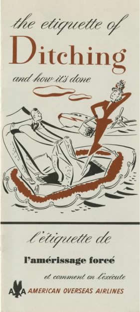
The whimsical cover of a 1949 American Overseas Airlines safety card.
When the airline industry first began including safety cards on flights (the exact date the practice started is unknown), there were no regulations and the information presented varied from airline to airline as did the tone and design.
One of the earliest examples Wolk calls out is a 1926 booklet from Imperial Airways, the British commercial long-range airline that operated from 1924 to 1939. The safety booklet is almost entirely text save for a diagram explaining how to put a lifebelt on (“as you would a waistcoat”) and the text itself doesn’t so much explain safety rules as attempt to calm the nerves of first-time fliers by explaining how the plane works.
With color printing came more beautifully-designed airline safety cards and a renewed focus. According to Wolk, cards of the period before and immediately after World War II were primarily concerned with emergency water landings, called “ditching” at the time. The tone was casual, upbeat. Polk cites a 1949 American Overseas Airlines card titled “The Etiquette of Ditching and How It’s Done” (at right) that features a cartoon of a man placing his jacket down inside a life raft for a female passenger to step over, as the plane sinks behind them. A Lufthansa card from the late ’50s depicted its instructions for a water landing with a cartoon of passengers in life vests happily feeding fish as a rescue boat floats in the background. And a Qantas card shows passengers on a life raft in the middle of the ocean, hanging out with a mermaid.
Water landing jokes have little place in the uber-informative safety cards of today. Industry-wide oversight put a stop to that. Following a spate of airline disasters in the ’50s, airline safety was more heavily regulated, and the content of airline safety cards became more important: Out with the carefree passengers, in with the serious exit diagrams.
The generic look, matching more sophisticated, straightforward language, was developed in the ’80s in time with the “icon-based, uniform interface of the personal computer.” And today, just a few small companies produce the safety cards you see on flights, which also accounts for the more uniform, staid designs we see most often. “What [these companies are] selling isn’t charm but rather compliance with regulations,” Wolk writes.
According to the FAA, airline safety cards’ “mode of presentation should be diagrammatic or pictorial, making written information, to the extent possible, unnecessary.” But, the FAA also notes, “Cards should also be interesting and attractive so passengers will want to read them.” This is where many modern airline safety cards are falling short: Can you remember the last time you picked up an airline safety card with any interest?
But, the tide may be changing. As dwindling space and increasing fees become synonymous with air travel, the least we deserve is an amusing airline safety card. Some airlines seem to agree. Virgin America, for example, shows a safety video before flights that is almost entirely musical (it even includes a child rapping about how to correctly put on an oxygen mask), and Virgin Atlantic’s safety card features an amusing image of a smoking hipster to drive home the no smoking rule. These safety materials manage to be attention-getting and informative, without making light of possible emergency situations.
A modern Virgin Atlantic safety card.
To find the airline safety cards mentioned here, and to pick your own personal design favorites, which catalogs thousands of safety cards viewable by year, airline, or country.