Our 6 favorite examples of guerilla signage
As a sign company, we are well aware of the power of signs to make a statement, which is why we love it when other people recognize this power and put it to good use. The best unsanctioned signs serve one of a few purposes: they amuse, provide a much-needed service, or raise awareness. And whether they’re erected as art pieces, PSAs, or as part of a creative marketing campaign, it’s rare that we can’t find something to like about a guerilla signage effort. Our favorites have a number of features we can get behind. Check them out below!
The Efficient Passenger Project
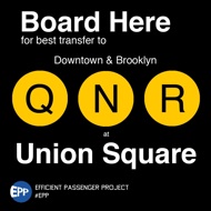
From the Efficient Passenger Project.
This two-part system helps people more efficiently navigate the New York City subway system. Passengers first look for the “EPP” sticker on subway turnstiles. If spotted, they can then search the platform for the “Board Here” plaques that indicate the best places to board the train to make certain transfers. When passengers get off at their stop, they’ll be right at the stairway closest to their next train.
Commuters who have to transfer trains as a part of their daily routines have likely memorized the optimal spot to transfer, but for those who haven’t quite gotten the hang of it, these signs have the potential to cut down on travel time and frustration. The project launched just last week with the first batch of signs going up along the L line. The MTA, the subway’s governing body, has spoken out against these signs citing concerns about overcrowding and uneven distribution on subway cars. The EPP, for their part, hope to one day work with the MTA to make these signs, which adopt the look of official subway signs, permanent installations.
Funny Signs on the London Underground
These transit signs were simply designed to put a smile on commuters’ faces, and they touch on every aspect of the Tube rider’s experience. There’s such variety in fake London Underground signage, in fact, that you should really just check it all out to pick your favorites. We’re partial to signs that point out the commuter’s daily struggle to isolate himself in uncomfortably crowded train cars (see below).
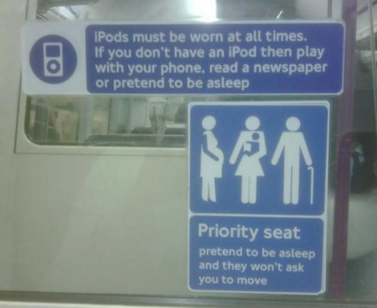
From The Poke.
Right of Way
From Liz Patek.
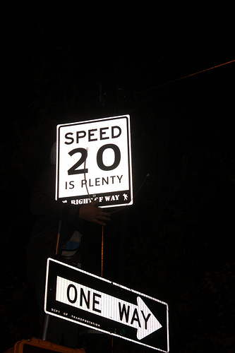
This organization has made headlines in the past for creating illegal bike lanes and memorials to pedestrians killed by drivers. More recently, though, Right of Way used signs to react to the death of a 12-year-old boy struck by a truck while retrieving a ball from a street.
Following the accident in the Park Slope neighborhood of Brooklyn, the City Council Transportation Committee voted on a bill to reduce the speed limit from 30 to 20 mph. But before any official ruling on the matter, Right of Way erected signs reading “20 is plenty” near Prospect Park West, the site of the accident. The signs are the same size, shape, material, and height as official Department of Transportation signs. “This road is directly adjacent to a park where children play and then cross the street to go home,” Benjamin Heim Shepard, a Right of Way organizer, said about Prospect Park West. “There is no reason drivers need to go 30 mph here, or on any residential street in New York City.”
The Rap Quotes
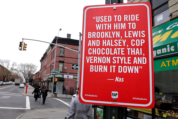
Jay Shells guerilla sign campaign is more of an artistic endeavor. In a project called “The Rap Quotes,” Shells, who is an artist and graphic designer, posts signs featuring famous rap lyrics at the specific locations the lyrics mention. These signs pay homage to a frequent practice in rap music and the artists themselves.
From Def Jam Recordings.
Shells started the project in New York City last spring before this winter. Most of the signs are simply affixed to street poles with nuts and bolts, so he expects them to be stolen. He sells t-shirts on Etsy to help support the project, and fans can send lyrics they’d like to see on a sign via Twitter.
Killy Kilford’s Happy Street Signs
From Killy Kilford.
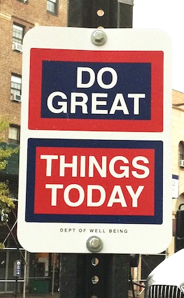
This past fall, British artist Killy Kilford installed nearly 200 “happy street signs” from the fictional “Department of Well Being” throughout New York City. The signs may look like ordinary street signs, but carry messages like “LISTEN TO YOUR HEART” and “HONK LESS LOVE MORE.”
Kilford created the happy signs because he felt that most other city signage featured more prohibitive communication (think “No Parking,” “No Standing,” “No Honking,” etc.). He wanted his signs to create “little moments of joy” to brighten people’s day.
The signs seem to have done their job. Kilford and a group of volunteers surveyed over 600 people and the majority were very supportive of the signage. He hopes to turn the Department of Well Being into a nonprofit that will promote well-being through art.
MyParkingSign’s “Taking my spot? Take my disability” signs
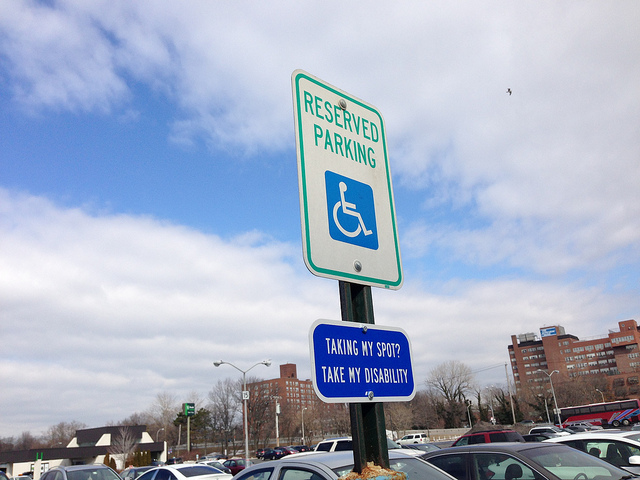
Inspired by French signs bearing a similar message, MyParkingSign, a SmartSign brand, posted signs reading “Taking my spot? Take my disability.” A few stealthy employees posted the signs under official “Reserved Parking” spots to remind potential illegal parkers of who the spots rightfully belong to. As you can read more extensively here, passersby seemed to like the idea, and while it’s hard to know whether or not the signs discouraged people from parking illegally, this guerilla signage, at the very least, made a few people take a moment to think about why those parking spots exist.
From MyParkingSign Blog.
Want to start your own radical sign campaign?
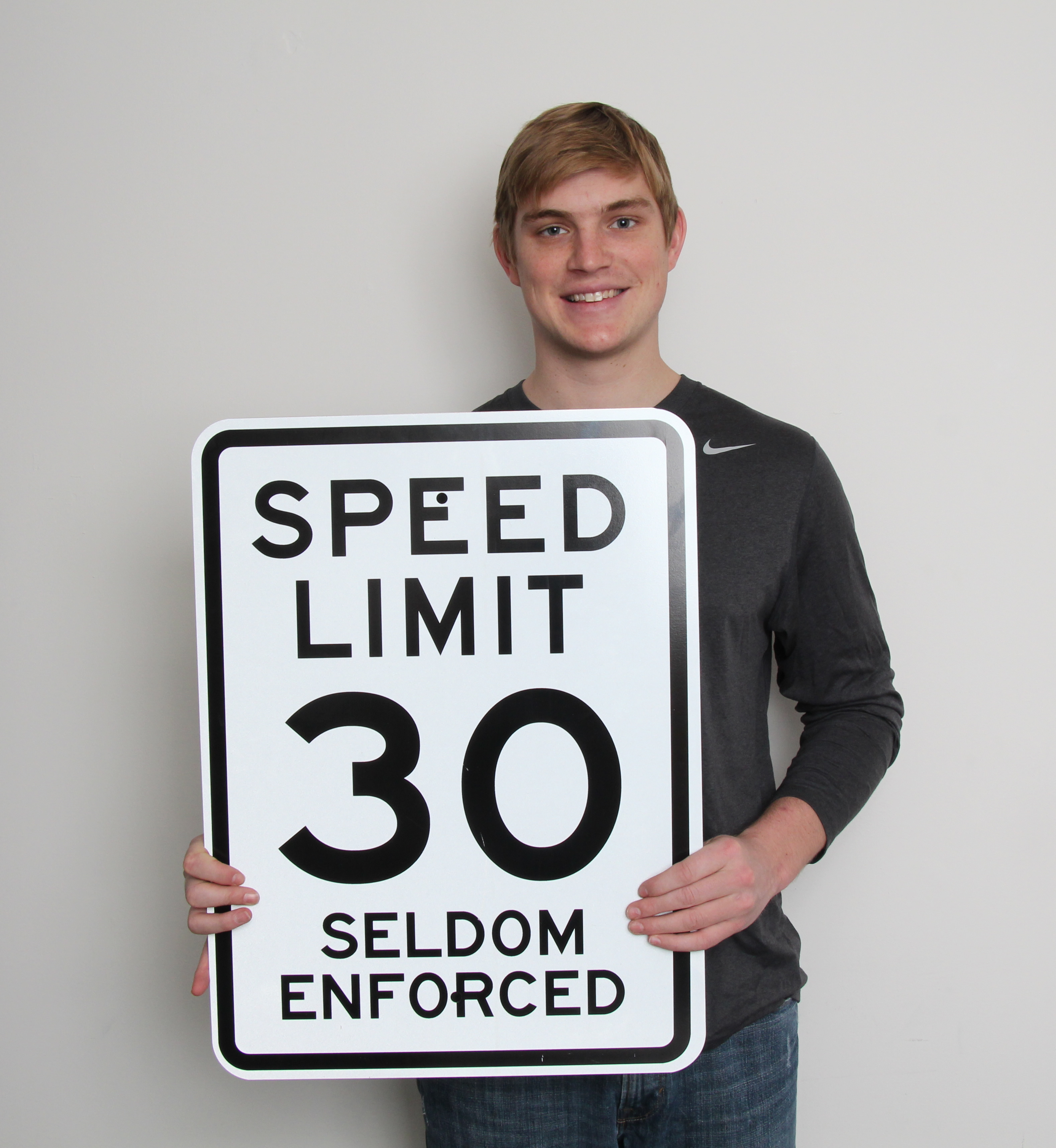
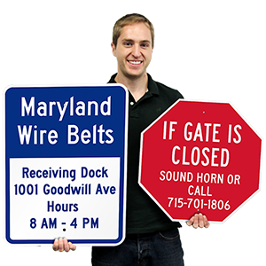
If you’d like to undertake your own guerilla signage effort, start with some custom signs, like this one, modeled by our intern, Mack. On first glance, what looks like a normal speed limit sign is actually a sign designed to give passing motorists a laugh as they slow to 30.
