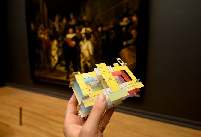
3-D museum map makes finding your way a snap
There’s a reason paper maps aren’t always easy to follow—and the blame no longer settles squarely on any one individual’s lack of an innate sense of direction. A simpler (and less accusatory) explanation could be the traditional design of most maps. They’re rendered in 2-D. In other words, they’re flat. And we’re stuck trying to figure out how to make them work to navigate a presumably unfamiliar three-dimensional landscape. No wonder those maps wind up upside-down half the time.
It kind of makes you wonder, though…What if maps were more like real life? What if they were rendered in 3-D?

The 3-D model easily folds into its flattened form. From Marjin van Oosten.
New York-based Dutch graphic designer Marjin van Oosten has taken the thought a significant step further. She designed the Paper Pathfinder, a 3-D pop-up model of a space that was disastrously difficult to navigate: the Rijksmuseum in the Netherlands, where more than 8,000 works of art reside in 100 different rooms. To further mystify museum-goers, the building is shaped like the number eight and has three floors.
The Paper Pathfinder is meant to strip away the confusion by allowing visitors to get a better sense of the layout of the building. Handed out for free, the new museum map is a welcome tool people can use to find their way to the artwork they most want to view. Considering the museum houses masterpieces by Rembrandt, Vermeer, van Gogh, and other artists, it’s not the sort of place one wants to wander aimlessly, possibly missing something amazing.
Anyone experienced in using fold-out paper road maps circa 1982 may wonder: Once the map is popped open for use, is it a complete nightmare to refold? The happy truth is, modern design promises better results. And it’s also worth noting that this concept is nine years in the making. Van Oosten started working on the map as a student and retooled it when asked to create a gift for museum visitors. If the Paper Pathfinder were anything like the unwieldy maps of yesteryear, would it have won a Dutch Design Award at Dutch Design Week (which it did this month)? Unlikely. And would van Oosten be in talks to create a similar map for another expansive museum, New York City’s Metropolitan Museum of Art (which she is right now)? Probably not.
The Paper Pathfinder is innovative in more ways than one. Besides upgrading the paper map, it proves low-tech solutions still have a place in a high-tech world.
